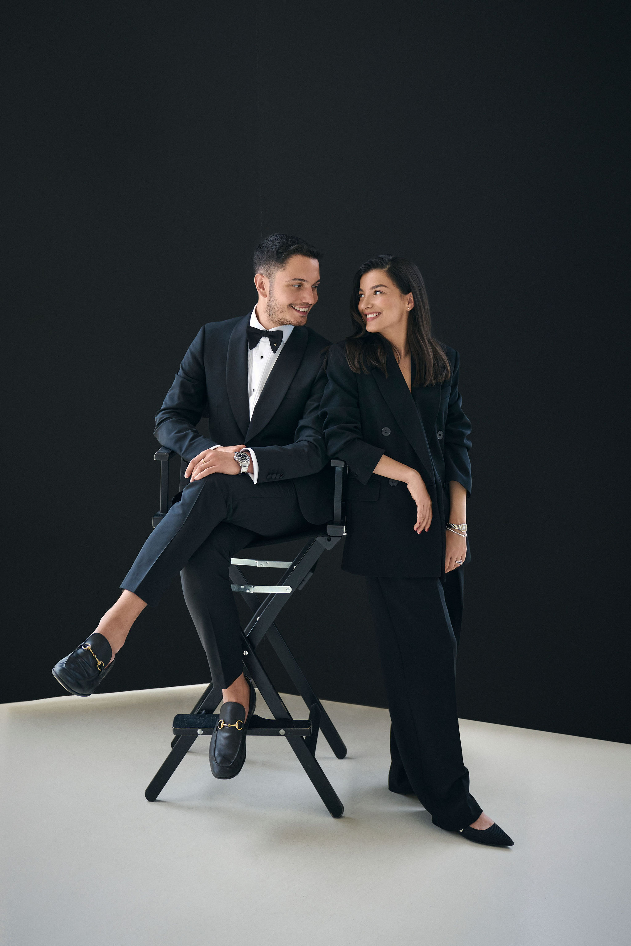
In 2022, we had the privilege of working with Chelsea of Heuss Design. As a fellow designer, I already loved her work and what she stood for, helping minority business owners to flourish. Designing a brand and website for yourself as a designer is so difficult. When the sky is the limit, where do you stop? It can feel overwhelming but we were glad to be there for Heuss Design. Chelsea had already worked with Leigh Ann Cobb on her modern and elevated brand photography and Loudmouth Co. for her engaging copy. We had strong building bloks for the site so the last thing we needed was a strong brand.
Brand Strategy and Design

We brought in AnnaKate Auten of Rhema Design Co. to create the brand and strategy. We knew her elevated and modern work would bring Chelsea to the next level. During the strategy phase, Chelsea's story of growing up on an apple farm and the impact her dad made in her life was very important. We wanted to build connection with Chelsea and her audience since her approach was so personal. The logo features a seed, hinting at the farm Chelsea grew up on. The colors and fonts are unexpected but timeless and playful. We also worked with AnneMarie of Lovendear Design to create icons for the process clients go through when working with Heuss Design. They feel modern and vintage all at once, bringing a lot of character to the brand.

Collaboration is so important in our process and company because we bring experts together to create the best results for our clients. Everyone gets to work in their zone of genius. It creates a unique and layered end product for our clients.
Website Strategy, Design & Development
The strategy behind the website was simple: create an elevated experience so people know Heuss is the real deal while having playful moments to keep visitors engaged and exploring. I wanted to keep layouts interesting so there's a lot of staggering. It feels very editorial, like a magazine layout. And I included cut outs in the images to create some visual interest. We wanted the copy to be front and center but also showcase the amazing photography so photos are big and are in the white space of type layouts.


I also wanted to incorporate her colors in a fun way so I made the blue front and center when you land on the site. The green is used more subtly but brings a lot of impact for the marquee detail on the homepage. We used a custom cursor, image appearing hover effects, and the split menu all add touches to this website that you wouldn't expect on Showit. The site feels super custom and dynamic.

What Chelsea had to say...
"As a fellow designer, when I was finally able to sit with the fact that I would never take (or find) the time to work through a truly strategic, intentional process like I do for my clients… I knew calling in an expert team would be key to having something I was truly proud of for years to come. I cannot say enough good things about Stefani and December Oak. I felt completely supported and seen throughout our work together and the result is a brand and website that will serve me for years to come. And it didn't hurt that I received nearly a dozen inquiries after our launch, either! I'm forever grateful."
Ready to book your own project?
We love working with designers and businesses making an impact. Reach out to work with us!


